Tuesday, January 5, 2016


Believe it or not, no brushes were used in the making of the above painting. Inspired by the works of Iris Scott, I set out to challenge myself and create a piece with finger painting. As I created this peice, there was no larger lesson for me to learn other than that fingerpainting may be child's play, but it also takes a large amount of practice to properly accomplish.

Also inspired by a contemporary artist, but not necessarily a specific one, was this lovely astrological inspired chess set. Artists such as May Ray, Laura Cowen or Staunton may have made ideal modern chess sets, but this one became the pride of my semester. In this piece I primarily struggled in colouring the pieces, and distinguishing the pieces to their according colour. However this was easily solved with acrylic paint and splattering each piece with their appropriate colour.

Tuesday, December 15, 2015

At the Museum

Photo 1: I did not react to this painting at all, I found it attractive, but it told too much of a story to me for it to be explored.
Photo 2: I adored this peice when I first saw it. But it didn't inspire me for a project.
Photo 3: upon seeing this peice I was at first in hate of it. But then it inspired me to go back on an old peice that was similar and redo it.

Monday, December 14, 2015

Unnoticed

Peer pressure.
Something we don't often notice we are under.
And something we don't often get to speak out about.
Using ink, an arrow stamp, and a silver pencil I coated my school in small black squares addressing this issue. Including the #releasethepreasure . however, after checking in multiple days, there was no one who noticed the project, at all.
This just goes to reflect back on what's often unsaid, that we cannot remove peer pressure, in any age.

Friday, October 30, 2015

A game of Galatic war

The game of chess, a game for all ages, genders, races, and now planets. Weilding the  post modern principal of repetition,  I used layers of tissue paper cut and pasted to create a chessboard mimicing the sun and the moon, at the same time. Imitations of the planets represent the king, queen, rook, bishop, and knight, with tiny moons as the pawns. Each side is splattered with their respective colour, and, if all peices are present, the set is fully functional! As proven since my art teacher defeated me...
I made a planetary chess set of the base that both of these, are  traditionally very nerdy things, that are overlooked partly by modern soceity.

Wednesday, October 14, 2015

The Best Art Supply Shop does not carry Art Supplies

I personally agree whole heartedly with the concept of Art being more than just the standard acrylics, paper, or pen. Thinking outside of the box is part of what Art's all about, and a majority of what I spend my childhood doing. A great number of art pieces that are well known or praised, are the ones that don't feature someone one would often expect. Using the unexpected actually reminds me a bit of a project I completed last year, if I may retouch on "Typing Art" Posted all the way back in January!
Using something no one wanted (A 1920's Encyclopedia of Non-Fiction Authors), I was able to not only create a work of art, but also something that was temporarily, functional.
I say Temporarily because remember that issue I had with the tablet sliding out?
Yeah..
that happened...
The screen blistered, and I had to get a new tablet... and was forced to throw my lovely project in the trash... I will try to do something similar in the future however, as I loved that project.
Here's an image for the lazy ones who don't want to scroll through to January.


I'm sure by now, you're aware how obsessed I am with words... words can be used too!!  They make beautiful pictures that anyone can enjoy! 
(I bear no claim to this photo or any that follow)

Nature can be art! 

Shoes can be art! 

Really, anything can be made into art, if you just set your mind to it.


Post Modern Principals- Reaction

In reaction to this article, I have little to say.
What I do have to say, is why attempt to define art? To say something has certain principles behind it, is simply to give something a plain, boring, textbook meaning. This argument has a lot to go with my previous post, Art without Meaning. As the way I see it, the more one attempts to get someone to put art in an educational light, the less power the art has. To define things such as juxtaposition, text, net art, and otherwise, would be less principles, than simply methods. To me, a principle is a standard or guideline, while these, are simply common themes that one can spot throughout many pieces of artwork.

Thursday, October 8, 2015

The Tear of Redemtion

In this project, the question of redemption came to mind. In particular, the question of what does Redemtion feel like? Infuenced by a relationship In a story, I built a story, using two smaller and one medium canvas, all contained the same background, one contained a girl alone, one contained a heart, and the last, contained two friends embracing.
In order to mimic the seperation, destruction became my friend, using scissors I first periced the canvases to be torn (the friends and the heart). Then, I punched the canvas to tear them apart litterally. Next I stitched the canvas with a red thread, symbolizing both anger and love, and last attached it all together with hot glue

Monday, September 21, 2015

Art Without Meaning has Meaning

Some argue that meaningless art can be considered mearly decoration, but that suggests that art with meaning cannot be decoration. Recently, I spent some time in Europe, and not one peice of decor was there simply to be decor. In my opinion, no art is without meaning, even if the veiwer is blind to it. The artist puts meaning behind every brushstroke, even subconsious, and it simply takes one seeking a meaning to place a meaning into the words.
Take a simple sculture of mishmashed papers, to most, its trash, but to someone, its the setting of a story of adventure, inspiring long treks on the beach, or a simple cupcake, delving into the childlike intregue and sweetness of a favourite TV show (as the pictured cake has a TARDIS frosted upon it.)

Thursday, September 10, 2015

Atypical Adoration

Ok... not a Biblically metahorical peice, but a romantic one. Inspired by the intimate, but non-physical relationship of two close friends of mine, one american, one english. This peice focuses on the art element of colour (color), blurring the division we often associate with these across ocean neighbours, and connecting them with words in a handful of colours, but primarly, the color constant, black. The theme of the connection is bound into the curling words that weave across the page, etching out quotes from him to her, her to him, or shared by the both of them.
Few realize that red, white, and blue, are the colours repeated most commonly in flags, and brass, an ageless metal, represents the agelessness of this forgotten repition. However,  binding all of this peice together would be the words and why they were said, for this peice displays colours of friendship, quotes of adoration, and in all, makes magic.
The peice was began using only fingers, and as you can see, just red blue and white, then brass aged it, and the quotes bonded it all.

Wednesday, January 7, 2015

Typing Art

I adored making this project, hands down. I drew the basic conceot design from a steampunk laptop I saw on pinterest, and being in need of a new keyboard case for my keyboard and tablet, and thus I began. Begining with an old book (I used the encyclopedia of contemporary authors volume 1.) I first hallowed out two vessels deep enough to host the desired devices, adding slots for the appropriate things such as cords, power switches  and the like. Then, the decopague began. As I selected various layers, backgrounds, and details, I made sure they were all things that reflected me. Afterall, I intended it to be something I used daily. The first layer, done entirely with gesso went over the keyboard and unified the peice.
With it, I attempted to go for an overall storybook feel to reflect my storybook life. Small town girl with a prince of a boyfriend, darling friends, suitable financial conditions and little worries within the world. After several layers of tissuepaper to create the background,  the trees, and the forest floor, I discovered it needed more color, amd added lauers of watercolor, marker, and pen. When the layers were complted, I returned to the words with appropriate colors to pull them forward through the text. I was very much satisfied with the ending effect. Likely I'll go back in and add fanning to the sides to further stabalize the peice and line the sides visible upon shutting with a gold leafing pen. In practicality, the book works as a fully functional keyboard case. However as a case itself, it needs some reinforcement which I will later add. If not held properly, the tablet will slide out when the book is shut. Possibly one of my favorite results, I am fond of this project, and love using it.

Thursday, December 11, 2014

Sacrifice of Joy

If one were to scroll back through this blog to January of last year, they would see my first "mixed media" peice, using paint, coloring utensils, and sandpaper on wood. These next two projects, were also completed via this non-traditional method. I rather enjoy using things such as tissue paper, magazine/printed images, and traditional drawing techniques together to create a masterpeice. In doing this, one can almost tell a story with their art far deeper than the one acheived via a simpler peice. It makes a person question "How many ways can I use this?" I recall often calling tissue paper useless as a child, and loathing water color, saying "It is too thin" However, in this peice I made use of the low opacity of those two materials, layering them to crate a fading effect.
This picture, is dedicated to my kindered spirit, she knows who she is. When I was looking through the theme options, I noted several that made me think of her, one of which was 'what is currently on your mind?'. Having been speaking with her the previous evening, I recalled how she was going through some low points in life. I longed to relay to her how much both I and Christ cared for her, and how Christ shed his blood for so that she might be free from that darkness. Thus, I set to work.
I began with a coat of Gesso across the whole of the two pages, then proceeded to layer various shades of tissue paper in the lower righthand corner. After coats of watercolor, oil pastel, pen, magazine pages (to create the hand) and some more gesso, I felt something was missing. Thus, grabbing some red ribbon, glitter, and more oil pastel I envisioned the blood going from my image of Christ's hand to the crying girl.,  and placed it on. This not only adheared the peice together, but surved as a unifying line that embodied the theme better than I had orginally planned.

Tuesday, December 2, 2014

Ringing with Envy

Make a joyful noise unto the Lord! Acheived through dozens of layers of Oil Pastel, I am proud of this peice. As I worked throuh the peice I stuggled in attempting to create the right colors with the 9 color of pastel that were available. In the orginal photo, one would notice the bells have nearly no shadow and are on a solid white background. This is due to their placement on a white polyfleece blanket, allowing me to create a background from my imagination, and the backgrohnd I chose had a rather stricking effect when I finished. Far away, the warping metal of the bells simply looks like a metal skirt, yet under the close proximity the peice was done, one might see a portal to another world.

Sweet Clay

In the process of making this project, I learned the importance of layers. It took about 4 layers for each peice, at a minimum. Were I to redo this project, I likely would tint the polyacrylic glaze in over  the shortcake to give the apperance of strawberry juice. The cakepops I would have made larger, and molded each of the details out of clay to simulate the fondant or candies one would use to decorate a cakepop. I did enjoy the combination of acrylic paints and clay, as it allowed for texture, shading, and details to be added which a glaze would not acheive, or not do so realistically. Overall im happy with the product, and would enjoy this process again.

Wednesday, November 5, 2014

New tools

Recently we began to explore three mediums in art class, these being colored pencils, chalk, and oil pastels.  Honestly, I adpre all three of these mediums, whith colored pencil being my far favorite. The detail and control one can muster via belending and layers is wonderful.
With chalk, one has to be careful as to distrbute the buildup and layer gently. The chalk often gets all over ones hands and well, everything.
Oil pastels tend to blend almost too much, all over eachoter and everythin they touch, risking stains to clothing and unwanted colors smearing over eachother.

Thursday, October 9, 2014

Sunny Daze

First off, I must honestly say how pleased I am with how this project turned out. I was ecstatic about the photo when I originally took it, and then I became enthralled in happiness when I discovered that for this project I would be researching a wonderful artist such as Vincent Van Gogh, and imitating his style for my own original work! Van Gogh is my favorite artist, and I adore all of his work. During this project, I encountered various obstacles as I had not yet worked with broken strokes, nor had I painted a landscape in a few years. The paint often seemed thin when I placed it onto the canvas, thus not achieving the thick bold strokes used by Van Gogh. However, eventually after layers upon layers I overcame this.
Throughout the project I learned a handful of new things about painting, before I had not known of a wash, and I must admit I'm rather fond of the effect the wash gave to the painting. The paint clung to the canvas easier, and it gave the whole piece a wonderful undertone that I find extremely inviting. Consistently in the piece I was given advice, and deciding to stray from my stubbornness, I followed this advice, and was more than pleased with the effect. From placing brown strokes onto the shingles of the barn roof, or adding more broken strokes into the piece, it seemed to get worse with every stroke, till I laid the last stroke.
Though I could not tell you the location of subject, I could detail to you that the photo was taken on a warm and humid afternoon, while I was on the bus to head to a Youth Retreat this past fall. For near thirty minutes, I held up my tablet and just took a picture of everything that passed, as that time of day the sun was in a gorgeous positioning that made my heart flutter. Possibly this was because of my obsession with light, which may also be my origins for my love of the simplistic and stunning works of Vincent Van Gogh.
The Original Photo

The Wash, Burnt Seina and a LOT of water

A Few sketches for the basic idea

My Baby :3 The Final Piece: Sunny Daze

Tuesday, September 23, 2014

Polychromatic Dreams

Possibly one of the most frequent events reoccurring in the Bible are dreams. Constantly God uses vivid dreams to speak to those he selects for important tasks. Many dispute that in modern day this doesn't happen, bit my piece reflects that often it can. We grow distracted, confused and darkened by the modern bustle that surrounds our daily lives. However, if one only steps back they see  the world at a much gentler point of view. Ralph Waldo Emerson once said that we are all but Dreamers, living in a dream.  
While working on this piece, I will honestly admit I encountered many problems. Colored pencils broke, pens ran out of ink, or perspectives were just off. 

Monday, June 9, 2014

Redeming Chains

This project, definatly was a learning experience. From creating the shards and leaves, to constructing the chain, the teqnique used to fabricate this necklace allowed me tomexpand my horizons with clay, learn to like wire, and become very, very thankful for tools.
The story, told through this peice, is that of the human heart. Were one to peice the shards together, they would find a heart. Our hearts, poisoned by the lies of this world, become shattered, broken, diseased and without repair. However, if one gives their heart to Christ, because of the cross, he creates us into a new, thriving lush creation.

Cross Point

Perspective. The whole of this peice very possibly could be sumed up in the  singular word, perspectove. When asking for ideas before I began the project, every one gave me a dofferent opinion, and even afterwards, I still received ideas that were different from my own. Though I was familar with acrylic, this peice taught me to layer, blend, layer, repeat. As I attempted to recreate the look of old wood on the peice. The drivig idea behind the peice, was the cross. From the perspective of many, it is a fencepost, keeping them in. Bordering their lives, and restraining them from being free. To the perspective of others, it is a lantern, a comfort, and a resting place.
Hopefuly, one can look upon the peice and be comforted, not set on edge, and realize, though a fence post the cross may be, it is one that protects us from something much worse.

Thursday, May 8, 2014

Shibori

Carter Smith is a Shibori artist from the Americas who has been working with Shibori for over 49 years. He hand dyes each peice of fabric used to create luxurious garments out of beautifuly dyed silks and fabrics. He works in various styles, though most of the final garments are free flowing and drape gracefully. I was attracted to the work by its way of making Tie Dye, not look like Tie Dye, but something almost natural, as if the fabric grew like that. 

Sunday on La Grande Jatte

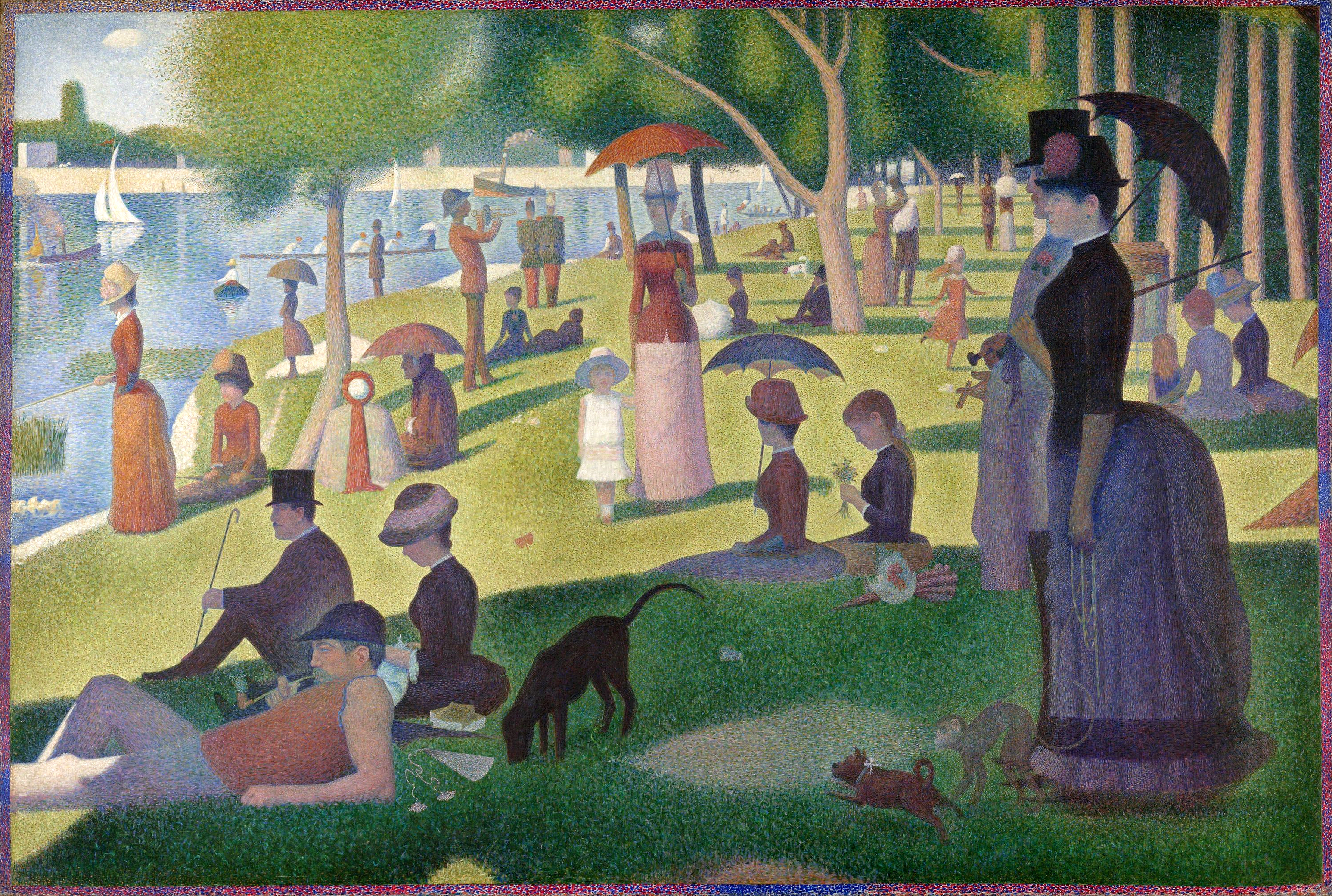
For this project, which consisted of re enacting famous paintings in order to produce a music similar to video linked here: 70 Million, my group selected the piece entitled: Sunday on La Grande Jatte.
My group, which consisted of Chelsea (Cardboard Dog & Presentation), Nichole (Cardboard Dog & Presentation, Tori (Woman in Red), and myself (Woman in Black, form, and lip syncing) worked minimally for the project, only creating 3 set pieces, and using costumes and surroundings to imitate the picture, without making the multitude shown in the original painting.
If I were to do the project, I would have selected an easier painting to imitate, as well as having memorized the song and played it while filming, as to improve the lipsyncing.